Users can't find their way around
Support tickets keep asking where a setting lives, and new customers need a call before they can use the product on their own.
My UI/UX design services are for products where the screen is mostly data: analytics apps, reporting tools, admin panels and the internal tools a team uses all day. As a Microsoft-certified Power BI analyst, I start from what the user has to decide and design the screen around that. Describe your product and your users in your own words, and I'll shape the work to fit, from a UX audit of one area to a full redesign.
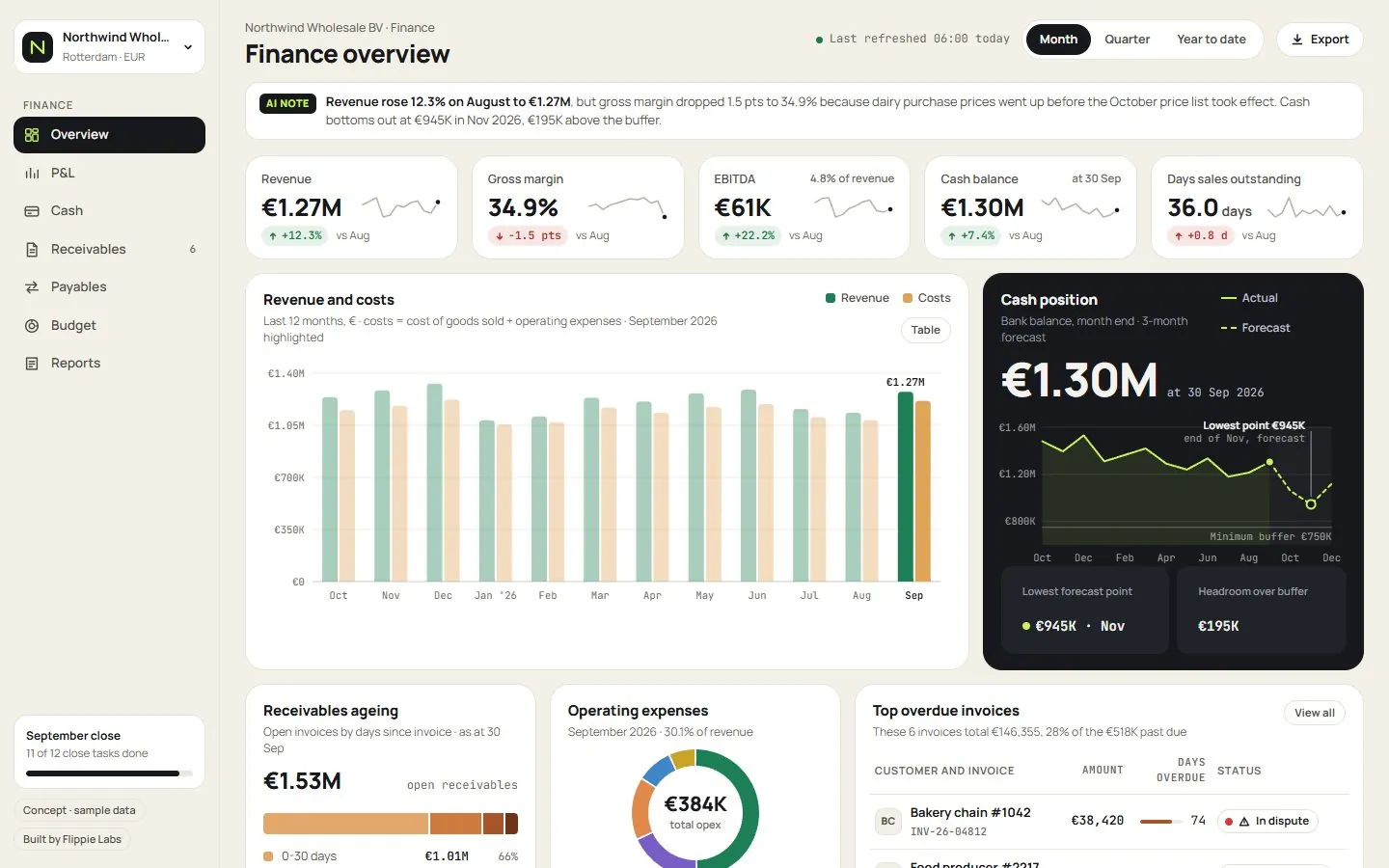 Six concept dashboards I designed for fictional companies in finance, SaaS, sales, logistics, e-commerce and marketing, all running on sample data.
Support tickets keep asking where a setting lives, and new customers need a call before they can use the product on their own.
Your product shows twenty charts on one screen and users still export to Excel to answer their actual question.
A developer built it quickly, it works, and the ops team hates it. People keep side spreadsheets because the tool is slower than copy and paste.
A starting point, never a fixed package: describe how you want it and I build it to match.
Most dashboard UI design goes wrong in the same place: it starts from the data that exists and tries to show all of it. I start from the questions the user brings to the screen. A finance lead opening a revenue view wants to know whether this month is on plan and what moved it. That suggests one number against target, a bridge chart showing what changed, and a table to drill into. The rest can live one click away.
My 5+ years as a Power BI data and business analyst left me with firm opinions about what makes data screens readable. Use one accent colour for the thing that needs attention and grey for everything else. Label lines directly instead of making people match a legend, and format a number the same way everywhere it appears.
Internal tools and B2B products have a user that consumer apps rarely do: someone who spends six hours a day in the same three screens. For them, keyboard shortcuts, dense tables, bulk actions and remembered filters matter more than whitespace. Good UX here often means removing clicks from the task that happens two hundred times a week.
A newer version of the problem is the internal app someone generated with AI over a weekend. The screens look finished while the logic underneath is unchecked. I can redesign the interface and, because data is my core work, also put it on a proper data model so the numbers on the new screens are right.
If you're not sure how big the problem is, start with a UX audit of one product area, such as onboarding or the reporting module. I go through the main tasks, mark where users get stuck, and rank the fixes by impact and effort. You get a written report with annotated screens, quoted as a fixed price before I begin. Some teams take the report to their own developers; others ask me to design the fixes next.
You show me the product and the main tasks, and if possible I watch a few users or recordings of them using it.
I map the tasks and propose a structure, and we agree on it before spending time on visual detail.
I design the key screens with real or realistic data, you review, and I extend the patterns to the rest.
Your developers get specs and components, or I build the front end and connect it to your API or database.
The fixed price depends on how many screens and flows are in scope, and whether you want design files for your developers or a working front end built by me.
The client reviews on this site are about data and dashboard work. For this service, here is work you can open and judge yourself, each labelled for what it is.
A stock analysis platform I designed, built and run myself: the interface, the web app and the data pipelines behind it, with scheduled refreshes.
Visit Intrinsiqqflippielabs.com: designed, written and built by me, including the live example dashboards and the contact form backend.
See the examplesLive dashboards for fictional companies, built by me on sample data to show what a finished build looks and feels like.
Browse the examplesAnything else? Ask me directly, I reply within a few hours on working days.
My UI/UX design services cover how the product works (the flows, navigation and structure) and how it looks and reads (layouts, components, charts and copy on the screen). In practice I start with the tasks users come to do, fix the structure around them, then design the screens. You can hire me for a UX audit only, for design files, or for design plus a built front end.
Yes, as close as possible to what you describe. There's no fixed package: you tell me in your own words what the product or screen should do, share references you like, and I design to that. If you already have a design system or a component library, I work inside it so your developers don't have to rebuild anything.
A UX audit is a structured review of how real tasks work in your product today. I go through the main flows, note every point where users hesitate, get lost or need support, and rank the fixes by how often users hit them and how hard they are to change. You get a written report with annotated screens. It's a custom quote with a fixed price, agreed before I start.
For most focused projects, one designer who can also build is enough. A SaaS design agency makes sense when you need research, branding, product design and development running in parallel for a large product. I'm one person, so you work directly with whoever designs and builds your screens. That suits a redesign of one area, a new reporting module, or an internal tool.
Both are possible. If you have developers, I deliver annotated designs, component specs and the edge-case states they need to build without guessing. If you don't, I build the front end myself in React and Next.js and connect it to your API or a Supabase database. Many clients start with design only and add the build later.
Dashboard UI design is mostly about choosing what not to show. A normal screen supports an action; a dashboard supports a judgement, so the design has to make comparison, change and exceptions obvious at a glance. That means picking the right chart for each question, consistent number formats, sensible defaults for date ranges and filters, and clear states for missing or late data.
I do the practical version that a small team can afford. I watch real users or session recordings, read support tickets, and talk to the people who handle customer questions. That's usually enough to find the worst friction in a B2B product. I don't run large formal studies or recruit panels; if you need that, a research agency is a better fit.
It's a custom quote with a fixed price, agreed before work starts. What drives it is the number of screens and flows in scope, how much of the product needs new patterns versus reuse, and whether I also build the front end. A UX audit or a focused redesign of one area, such as a reporting module, is a common and affordable first project.
My custom web app development services cover the logged-in tools B2B firms build around their own data: client portals, customer portals and internal apps.
Custom quote · Learn more Data & dashboardsCustom data dashboards, live on your own data and APIsI build custom data dashboards that pull straight from the tools your business already runs on, so the numbers refresh on their own instead of in someone's spreadsheet.
from €600 · Learn more Websites & UI/UXLanding page design services for B2B offers that are hard to explainMy landing page design services start from the fact that a visitor from an ad or a search result decides in a few seconds whether your offer is for them.
Custom quote · Learn more