Power BI dashboard examples (and how to build one that gets used)
Most "dashboard example" galleries are screenshots with no context, so you learn nothing you can reuse. This one is different. Below are real Power BI dashboards I've built, each with a short teardown of why it works, followed by the main dashboard types, how to build one properly, and where a template beats custom work. If you only take one idea away, make it this: a dashboard is a decision tool, not a wall of charts.
On this page
What a Power BI dashboard actually is
A Power BI dashboard is a single interactive view that pulls your data into charts, tables and headline numbers you can filter and click into. The important word is interactive. Unlike a chart pasted into a slide, it sits on a live data model, so when the underlying data refreshes, the dashboard updates itself. Nobody re-exports anything.
People use "dashboard" loosely to mean any Power BI view, and that's fine. If you want the precise distinction between a dashboard and a report, I've written that up separately, but for the rest of this page I'll use the everyday meaning: one clear, refreshable screen that answers a question.
Real Power BI dashboard examples
These are builds from my own work. Where the figures are confidential they've been swapped for sample or anonymised data, but the layout, the model and the design decisions are exactly as delivered. Read the teardown under each one. That's where the reusable lesson is.
1. Personal finance & net worth dashboard
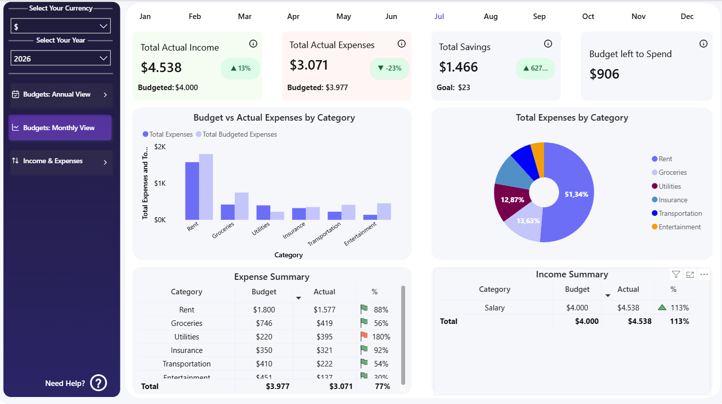
A whole household's finances on one page: income, spending, savings rate and net worth over time.
Everything you need to make a money decision sits on one screen, with currency and year filters instead of five separate tabs. Your eye lands on net worth first, because that's the number that matters, then works down into the detail. Headline number on top, supporting detail below. I copy that ordering into almost every dashboard I build.
2. Debt payoff tracker
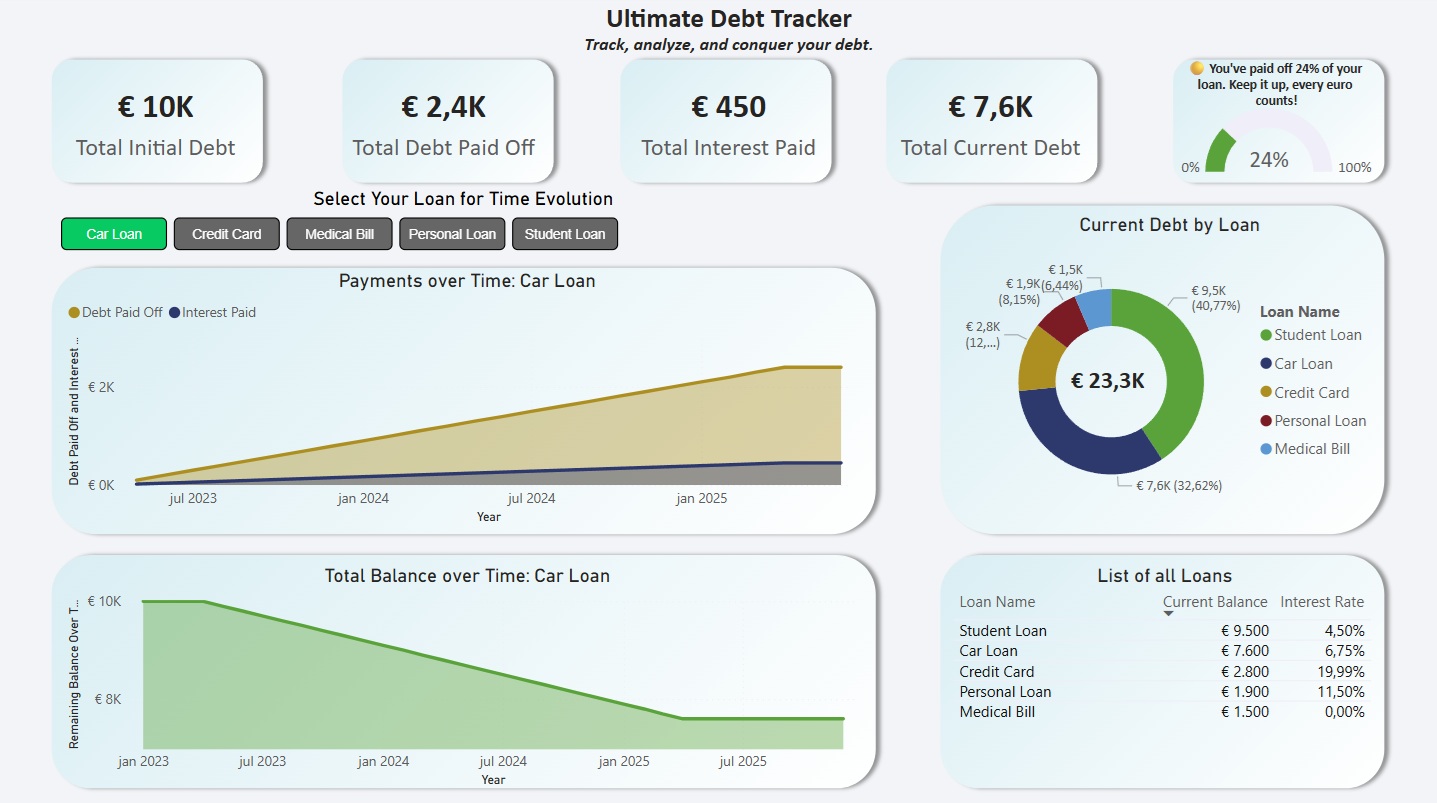
Every debt in one place, with a single, motivating payoff date front and centre.
It has an opinion. Instead of listing every balance and rate as if they matter equally, it leads with the finish line: the projected payoff date. That's the thing people actually care about. A dashboard that answers "so what do I do now?" beats one that just reports the current state.
3. Debt strategy & forecast
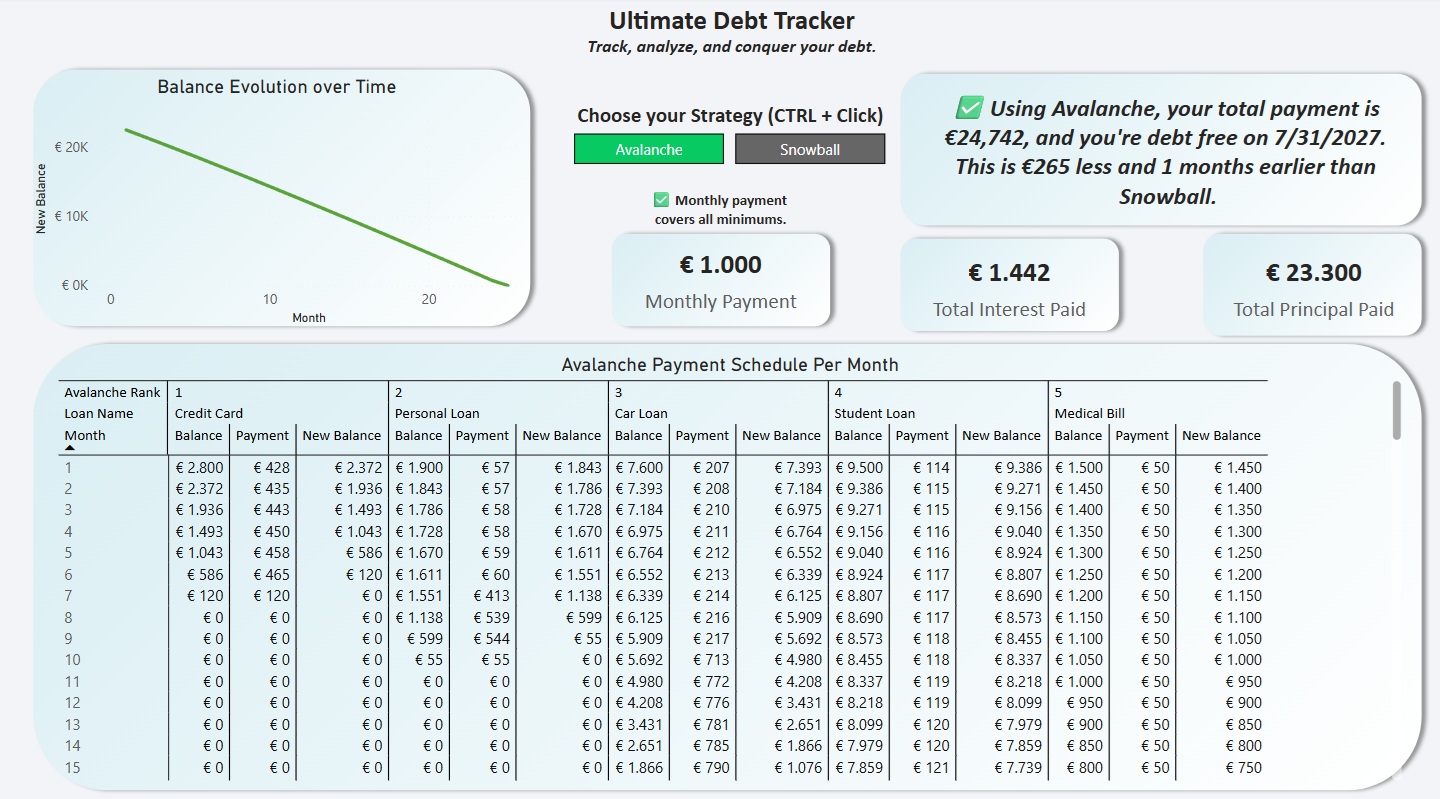
Snowball vs avalanche compared side by side, with the interest saved by each and a twelve-month forecast.
This is where DAX earns its keep. Both strategies are modelled rather than typed in, so the comparison updates the moment a balance changes. Once a dashboard has to compute a recommendation instead of just showing a value, everything rides on the data model being right.
4. The redesign: before and after
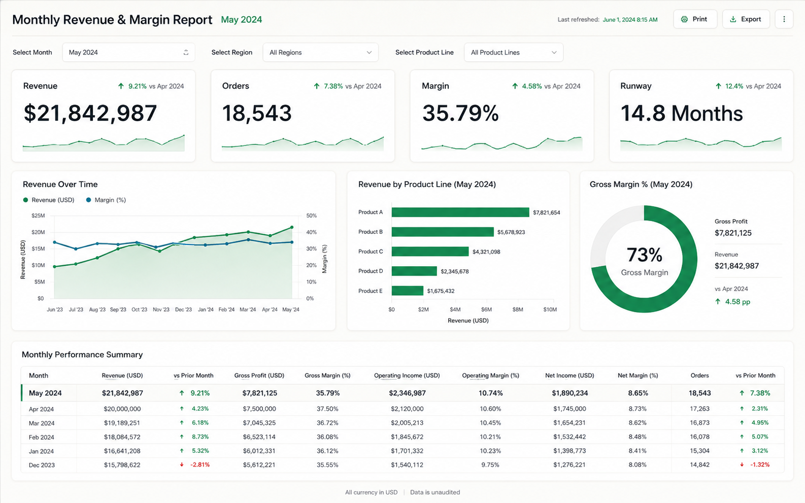
A monthly report I inherited and rebuilt. Same data, same KPIs, a very different amount of trust in the result.
The "after" isn't prettier for its own sake. Removing a dozen redundant visuals, fixing the relationships underneath and giving each number room to breathe is what turns a report people quietly ignore into one they open every Monday. Most of the improvement is subtraction.
5. Live web dashboard
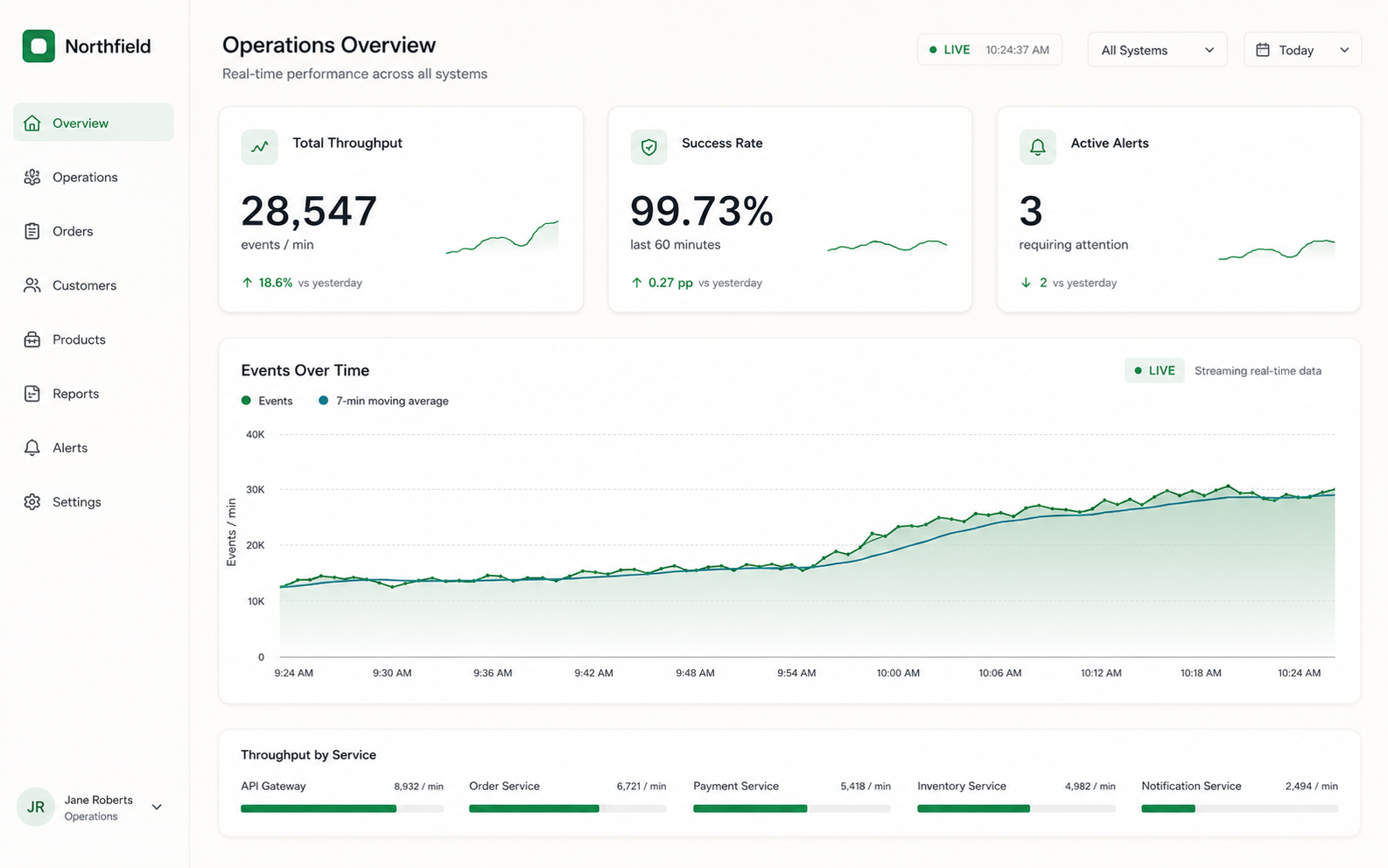
A dashboard that pulls straight from an API and refreshes itself, so the number you see is the number right now.
No manual exports, no stale decks. When the cost of getting the latest figures drops to zero, people check them far more often. And a dashboard nobody opens is just an expensive screenshot, so that matters more than it sounds.
6. Business & sales overview
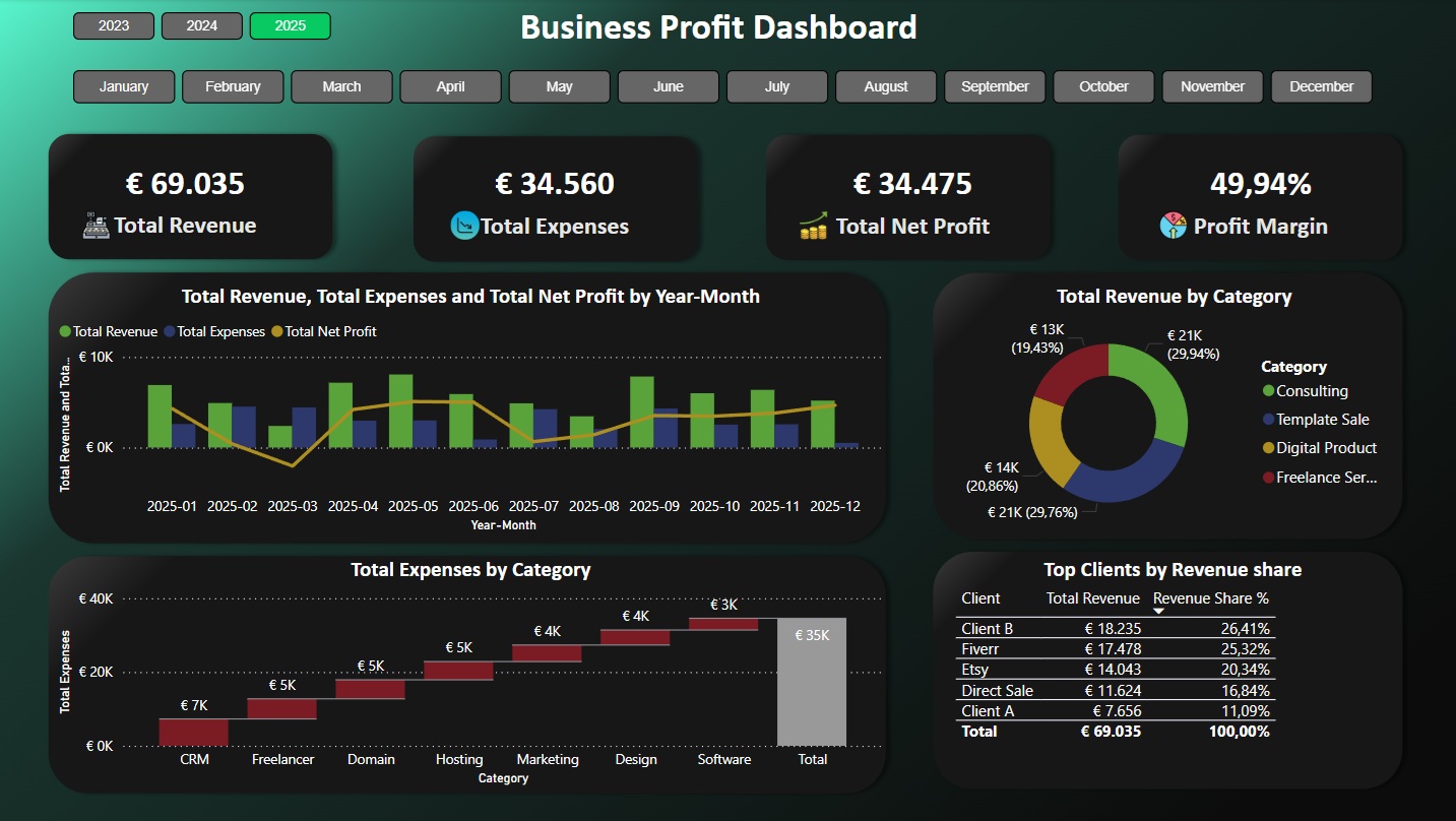
Revenue, orders and margin as headline KPIs, with quarter-by-quarter trend underneath.
Three KPIs, not thirteen. A leadership overview should be readable in the ten seconds someone gives it before a meeting. Every extra tile you add makes the important ones harder to find.
Want more, with live numbers you can click? The work section on the homepage has an interactive before/after slider, and the template gallery shows finance, income, stock and business builds you can open yourself.
What makes a good Power BI dashboard
After 80-plus builds, the dashboards that succeed all share the same handful of traits, and the ones that get abandoned fail the same way. Here's the short version.
- It answers one question. Before any chart goes down, name the decision the page supports. "Are we on track to hit the quarter?" is a dashboard. "Show me everything about sales" is a data dump.
- The model is clean underneath. Trustworthy numbers come from a proper star schema and correct DAX, not from the visuals on top. This is the invisible 60% of the work.
- It uses restraint. A few well-chosen visuals beat every chart type Power BI offers. White space is a feature.
- Hierarchy is obvious. The most important number is the biggest and highest. The eye should know where to land without being told.
- It's honest. No dual axes that exaggerate a trend, no pie chart with eleven slices. If the design flatters the data, it's lying.
The test I use: if someone has to ask what a number means, the dashboard has failed, however good it looks. Clarity is the job.
The main types of Power BI dashboard
Most business dashboards fall into a few families. Each has its own conventions, so it's worth knowing which one you're building before you start.
Sales dashboard
Pipeline, revenue, win rates and rep performance, built to answer one question: are we going to hit target?
Guide coming soonKPI dashboard
A tight set of headline metrics against targets, for a leadership team that has ten seconds.
Guide coming soonFinancial dashboard
P&L, cashflow, budget vs actual and runway: the reporting backbone a finance team runs on.
Guide coming soonPower BI vs Tableau
Which tool wins on price, learning curve and visuals, and when Tableau is genuinely the better call.
Read the comparison →Excel or Power BI?
When a spreadsheet is genuinely enough, and the moment it starts costing you more than a dashboard would.
Read the comparison →How to build a Power BI dashboard
Here's the process end to end, the same one I use on client work. This is the shape of it.
- Define the decision. Write down the one question the dashboard must answer and who's asking it. Everything else follows from this.
- Connect and clean the data. Pull your sources into Power Query and fix the mess (types, duplicates, inconsistent labels) before you model anything. Rubbish in, rubbish on a nice chart.
- Build the data model. Arrange your tables into a star schema with facts in the middle and dimensions around them. This is what keeps the numbers fast and correct.
- Write the measures. Create your DAX measures for totals, comparisons and time intelligence. Test each one against a number you already trust.
- Design the page. Lead with the headline number, group related visuals, and cut anything that doesn't serve the decision. Restraint, again.
- Add interactivity and security. Slicers, drill-through, and, if different people should only see their own numbers, row-level security.
- Set up refresh and hand over. Schedule the refresh so it stays current on its own, then document it so the team can actually use it.
If it turns out slow when you're done, and that's a common surprise on a first build, the fix is almost always in the model rather than the visuals. I've written up the usual suspects behind a slow report and how to clear each one.
Templates vs custom: which do you need?
You don't always need a bespoke build. A well-made template gives you a working layout and data model to drop your own numbers into, which is perfect for common cases. Custom work earns its price when the data is the hard part.
| Start from a template if… | Go custom if… |
|---|---|
| Your data is fairly tidy and lives in one or two places | Your data is messy or spread across many sources |
| Your use case is common (finance, sales, KPIs) | You need automated refresh, security or bespoke logic |
| You want something working this week on a small budget | The dashboard is client-facing or business-critical |
My Power BI templates cover the common cases, and if you're weighing the spend, what a dashboard actually costs breaks down every tier. Not sure which way to go? Tell me about your data and I'll give you a straight answer, even if the honest answer is "a template will do."
Frequently asked questions
What is a Power BI dashboard?
A single, interactive view that pulls data from one or more sources into charts, tables and KPIs you can filter and drill into. Because it sits on a live data model, it updates when the data refreshes, so the numbers are current rather than a snapshot pasted into a slide.
What makes a good Power BI dashboard?
It answers a specific decision on one screen, sits on a clean data model so the numbers are correct, and shows restraint: a few well-chosen visuals rather than everything at once. If someone has to ask what a number means, the dashboard has failed, however good it looks.
What's the difference between a dashboard and a report?
In everyday use, people say "dashboard" for any interactive Power BI view. Strictly, a report can be many pages built on a dataset, while a dashboard is a single pinned canvas in the Power BI service. What matters to most businesses is the outcome: one clear, refreshable view of the numbers behind a decision.
Can I start from a template instead of building from scratch?
Yes, and often you should. A well-built template gives you the layout and a working model to plug your numbers into. Go custom when your data is messy, spread across sources, or needs security and automated refresh.